Announcing a New Brand Design for Edmonton Exchanger
We are proud to announce a new logo for Edmonton Exchanger, an innovative brand design representing a new era for our company!
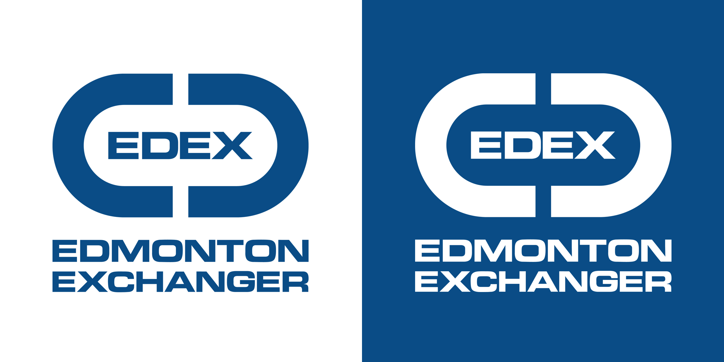
Edmonton Exchanger ownership wished to create a new brand design that was simple, clean, modern and easy to use in a digital environment. With that in mind, it needed to honor the legacy, reputation and brand recognition of the old logo, and therefore carried over some key elements from the old design. Although all legal company names remain the same, the “group of companies” was dropped from the logo to simplify the design by reducing the amount of text.
The new logo is all blue in color, or all white when placed on a dark background. It retains the two “C’s” of the old logo, which represent pressure vessel heads placed on either end of a pressure vessel, but replaces the inner portion of the graphic with the EDEX text. The transition to the EDEX abbreviation is another simplification in this logo that refers to Edmonton Exchanger’s nickname within the industry. The shape of the logo is derived from the shape of a heat exchanger bundle or a pressure vessel, and also throws back to the shape of the original yellow Edmonton Exchanger logo from 1975.